Table Reservation App

Mesa 24/7 is the go-to platform for restaurant reservations and gastronomic experiences in Peru and Chile with no direct competitors in its market. Users depended on it, but the app wasn't reflecting that loyalty.
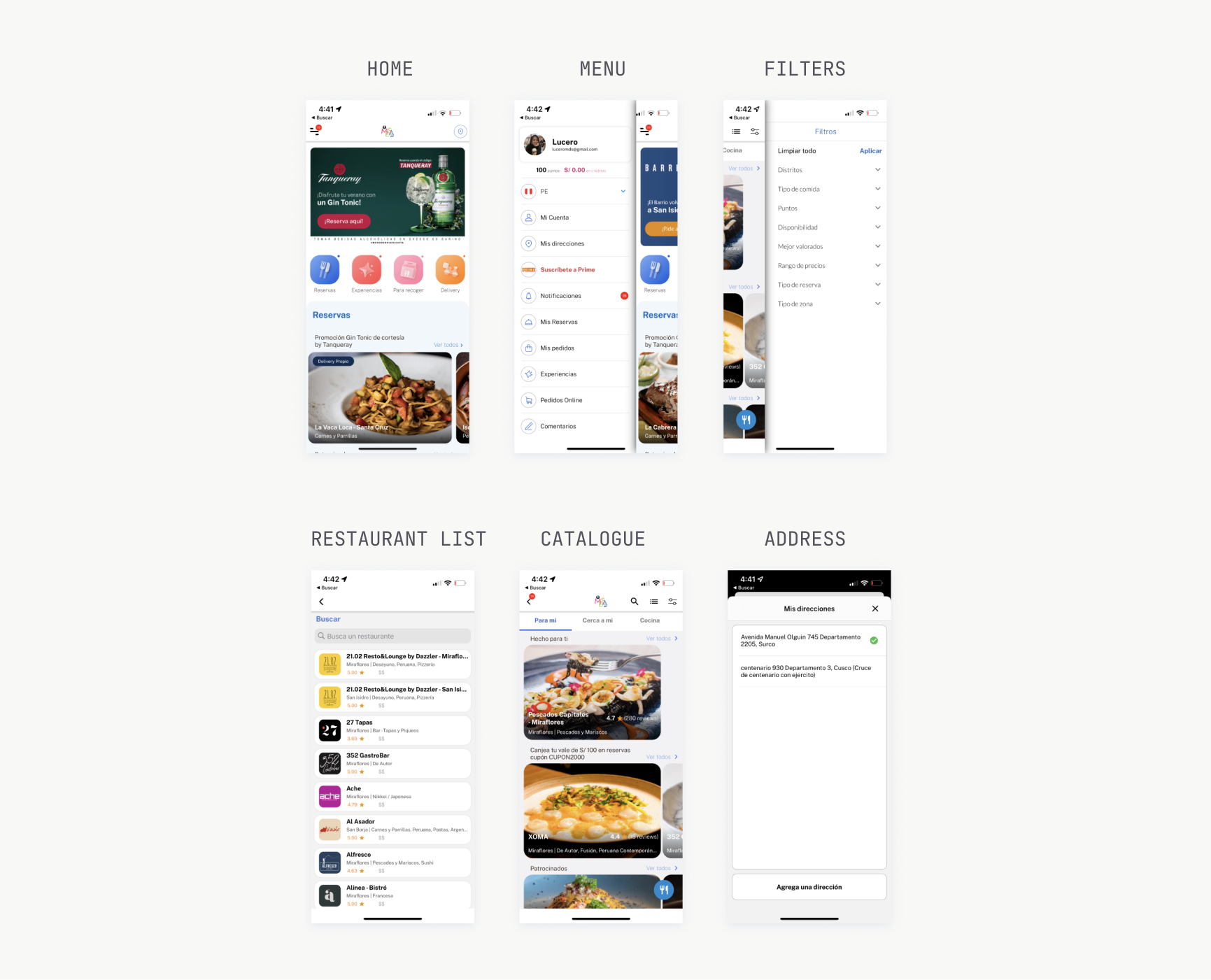
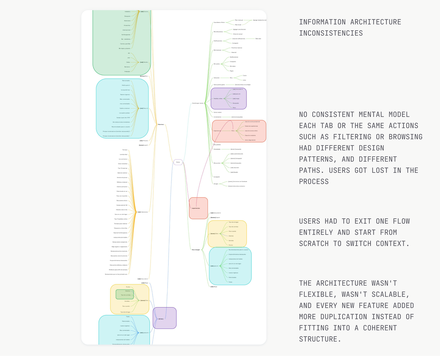
The information architecture was inflexible and full of redundancy: the same actions had different screens depending on where you entered from, sections repeated across flows unnecessarily, and navigation was buried in a hamburger menu. The experience didn't match the high quality of the restaurants it hosted.
Interview users to find the real friction
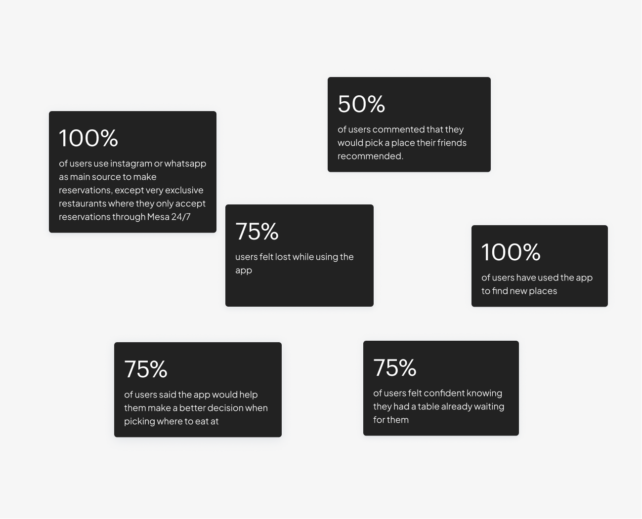
I interviewed 8 people to understand their motivations and blockers, and from there I wrote user stories: users wanted to trust their reservation was handled properly, pick from curated places, have a smooth experience with no roadblocks, and have live reservation info on hand.
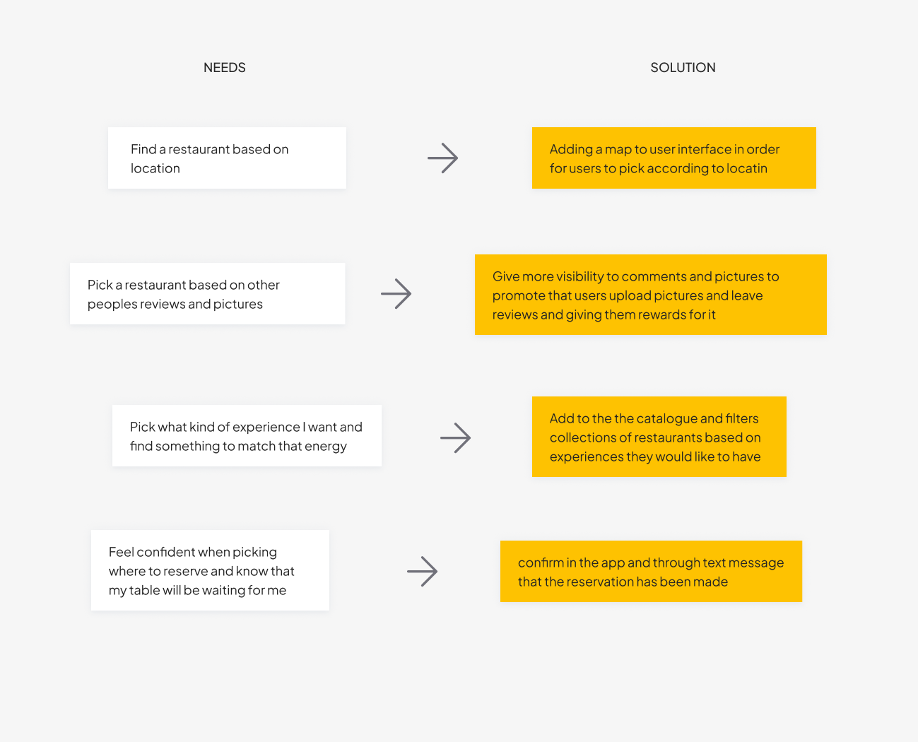
Map pain points to needs to solutions
I built a needs matrix pairing each friction point with a user need and proposed solution. Then a feasibility/desirability matrix to weigh user value against implementation effort. Priority 1: location-based search and better photo visibility. Priority 2: IA restructuring and search filters.
Restructure the navigation
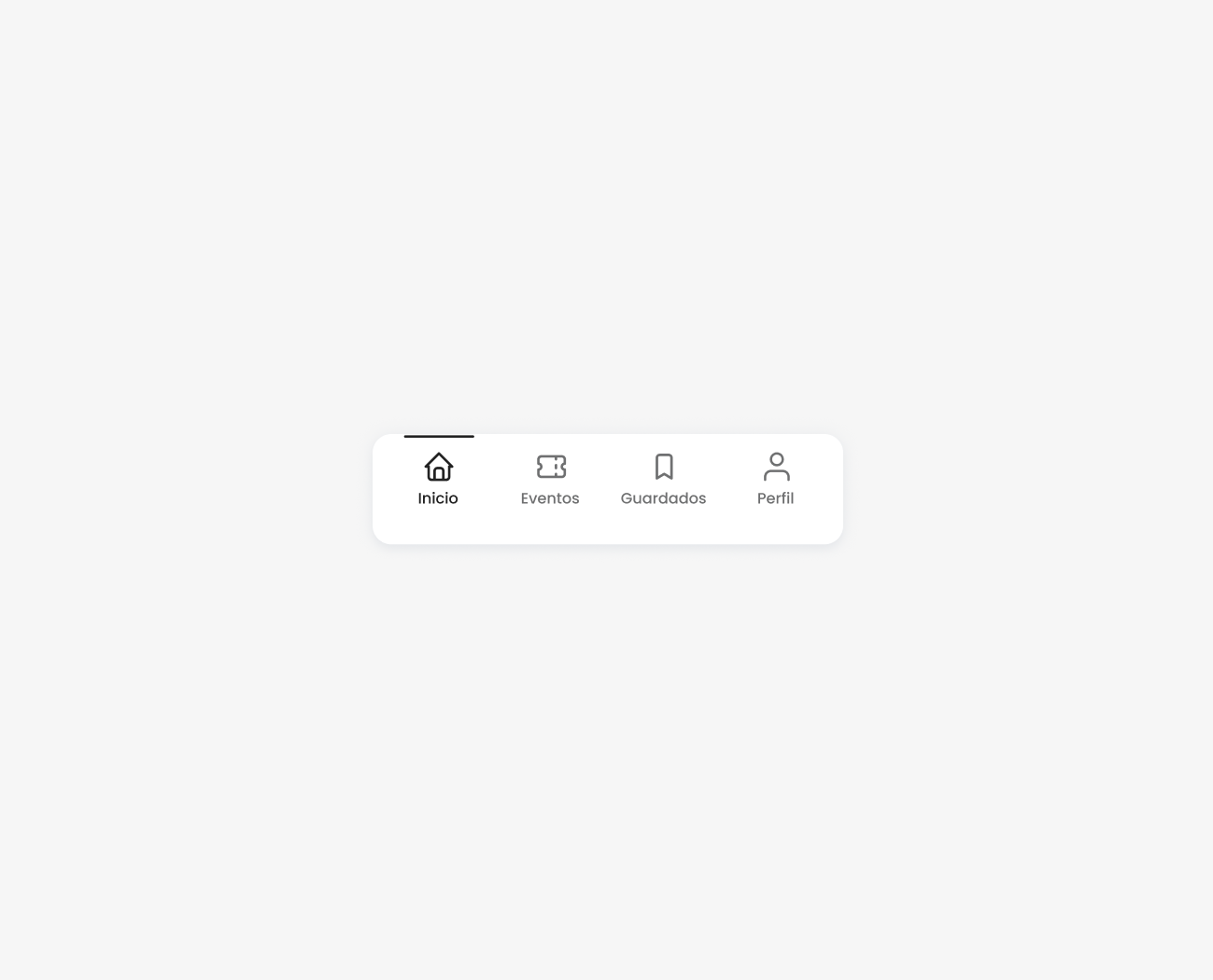
Users reported feeling lost in the platform. The IA had poor flexibility, repeated sections across flows, and the same actions built with different design patterns, creating an inconsistent mental model. I rebuilt it from scratch. Replaced the hamburger menu with a four-tab navbar: Home, Events, Profile, Saved. One path to each action, not three. Scalable by design.
Design the key features
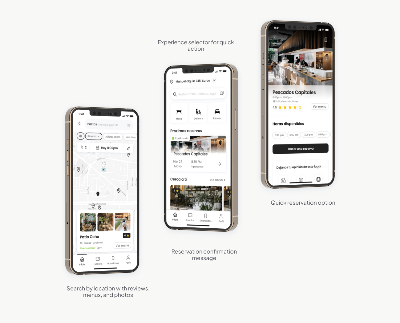
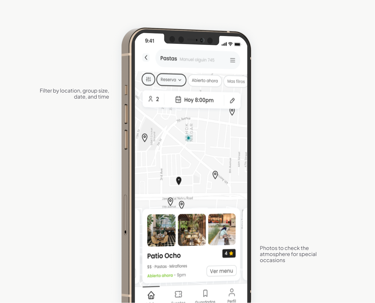
The research pointed to three UI outcomes: a reservation confirmation card on home for upcoming reservations at a glance, map-oriented navigation to pick restaurants by area, and experience-based filtering to browse by occasion, not just cuisine.
Build user trust
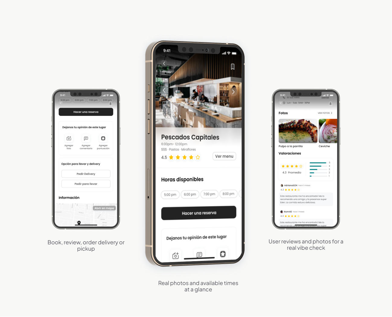
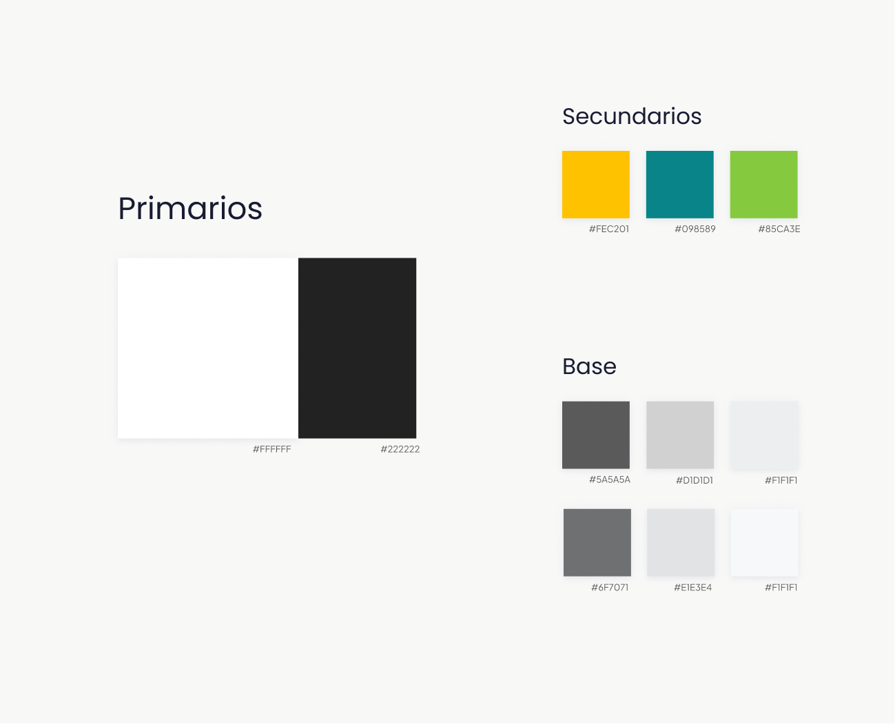
Users didn't trust the platform with their reservations. I addressed this with three changes: a reservation status and confirmation screen so users always know where their booking stands, user reviews so diners can hear from real people instead of relying on restaurant-curated content, and more prominent photos so users can judge the atmosphere for themselves before booking. Also added a visual rebrand to align the product's look and feel with the new experience direction.