Event Builder Tool
Event organizers, venue managers, DJs were not tech people. They're busy, often managing multiple events at once, and rarely have all the details locked in when they start building an event.
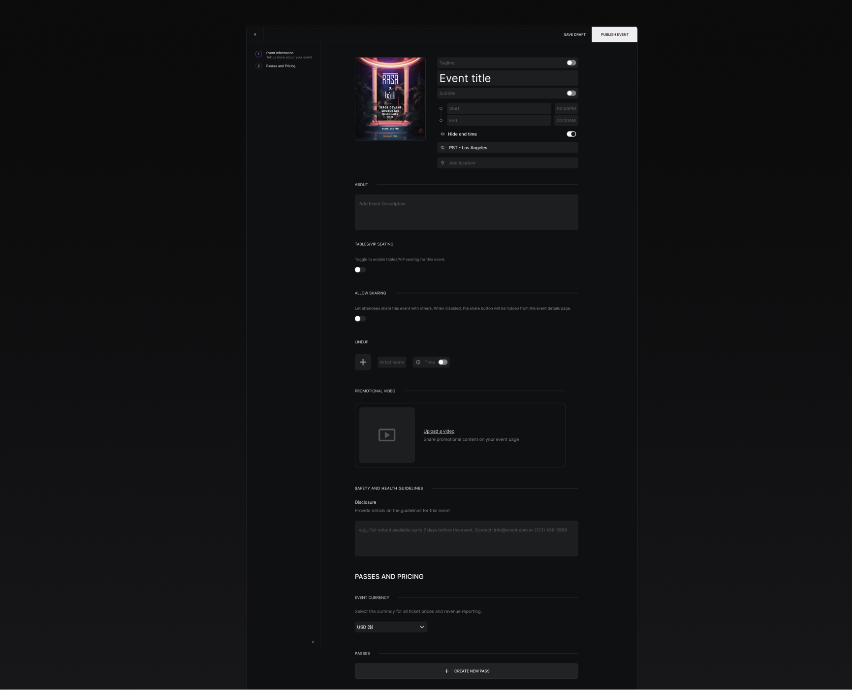
Our event creator v2 wasn't flexible enough. Every section lineup, tables, disclosure, promotional video was laid out upfront. The page was long and heavy. Organizers were left with this incomplete feeling before publishing, even when those sections were entirely optional. And as the platform grew, we added more features that didn't fit well as inline fields on an already-crowded page.
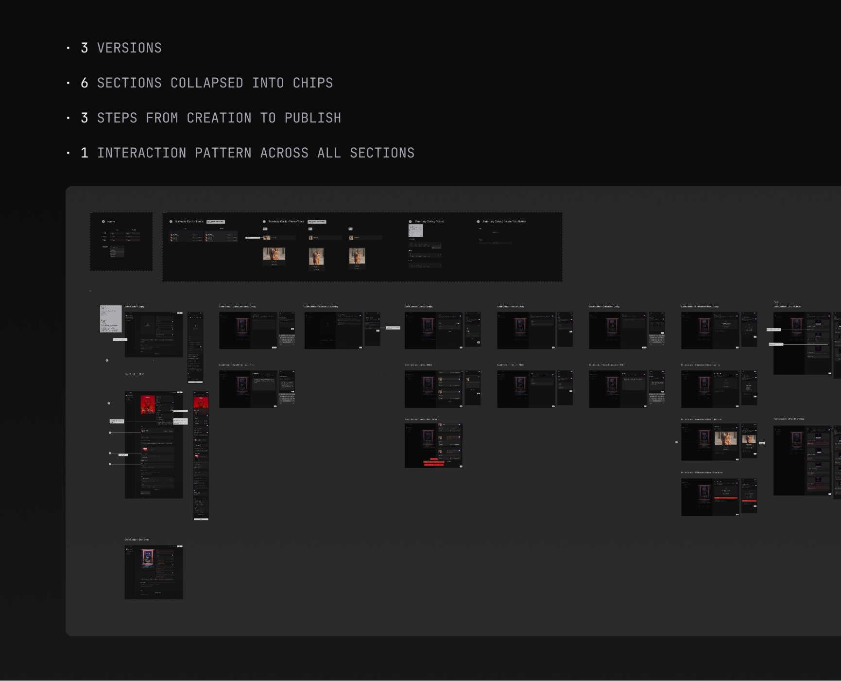

How do you turn a complex event creation tool into something fast and flexible for busy organizers and keep it that way as the product grows?
Make sections discoverable as the need arises
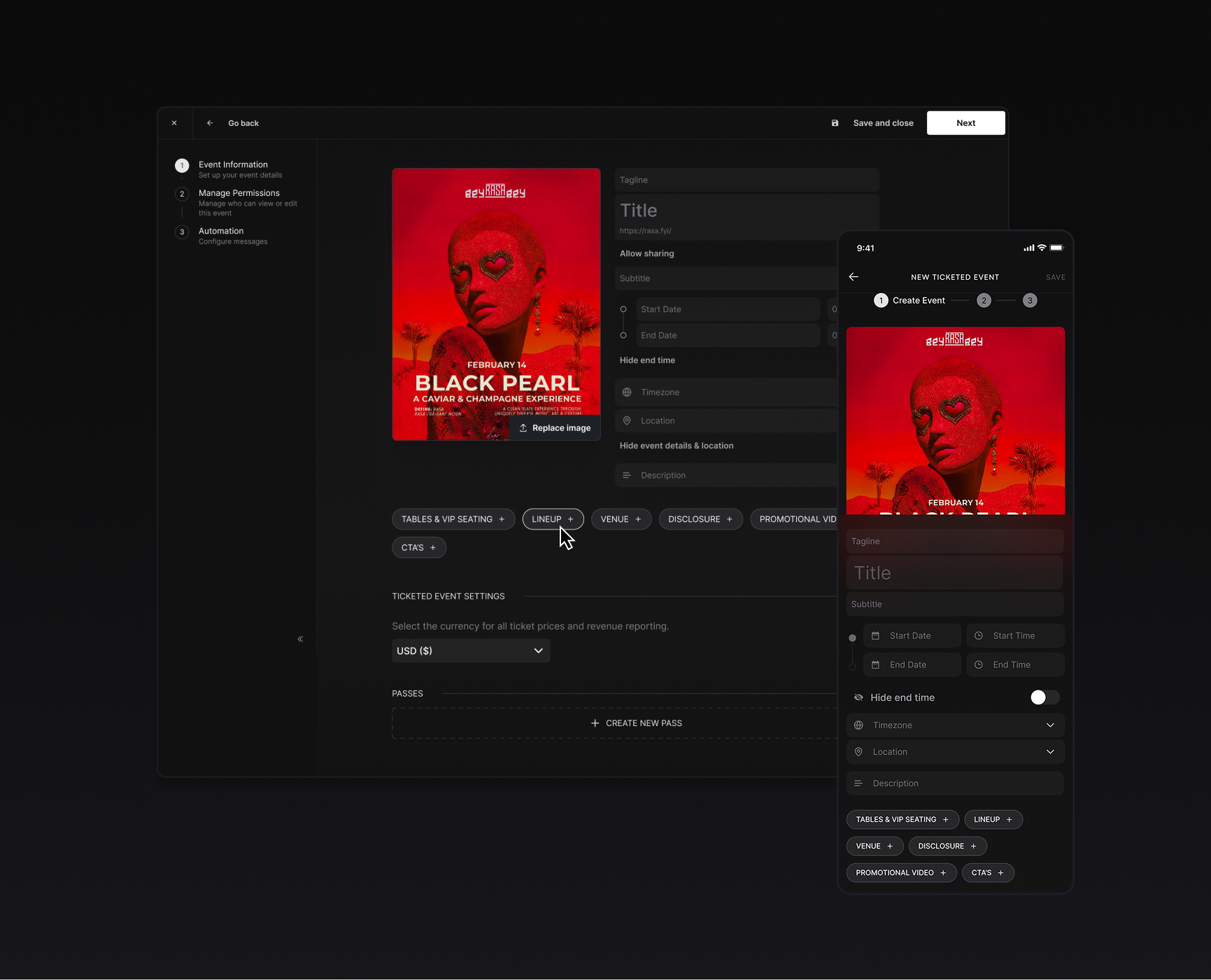
I collapsed six optional sections into chips. The page starts short with just the essentials. Organizers add what they need and can ignore what they don't. You’ll discover things as you need them. No empty sections, no false sense of incompleteness.
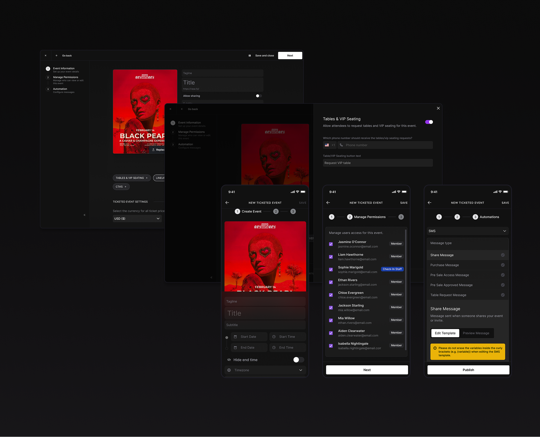
Give complex sections their own workspace
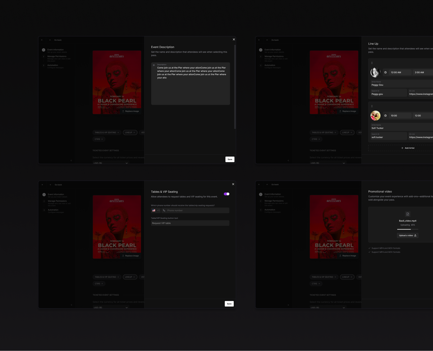
Tapping a chip opens a drawer on the right. The main form stays visible on the left as context. Every section follows the same pattern: chip → empty drawer → fill it out → save. One interaction model for everything so you only learn it once.
Make the page its own summary and editor
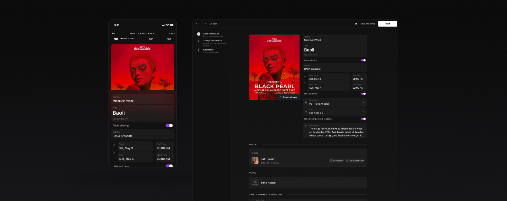
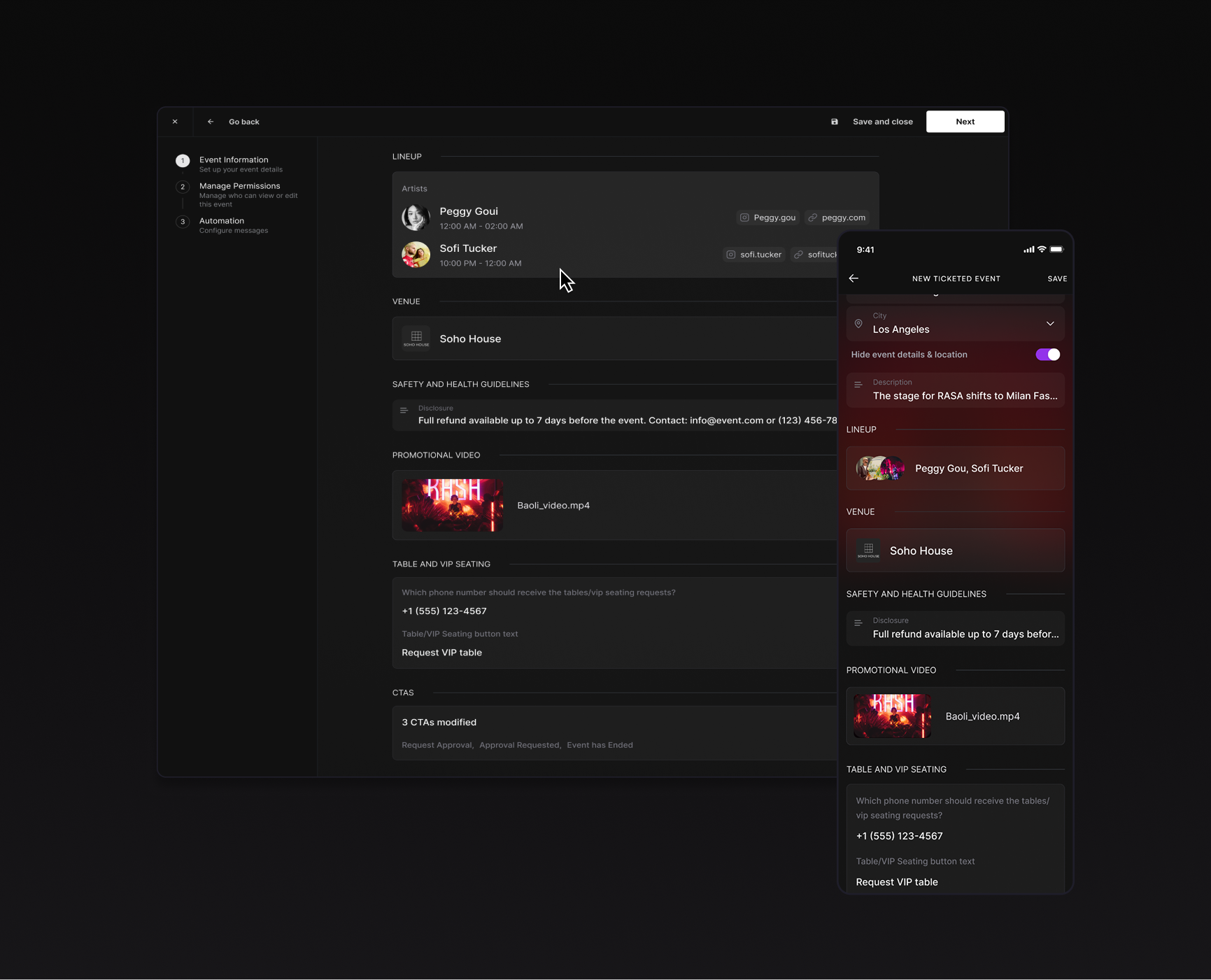
When you save, a summary card appears on the main page. A quick view for easy scanning. The page only grows with real content. This way the creation tool and the editor view are the same thing.
Stress-test with the hardest case
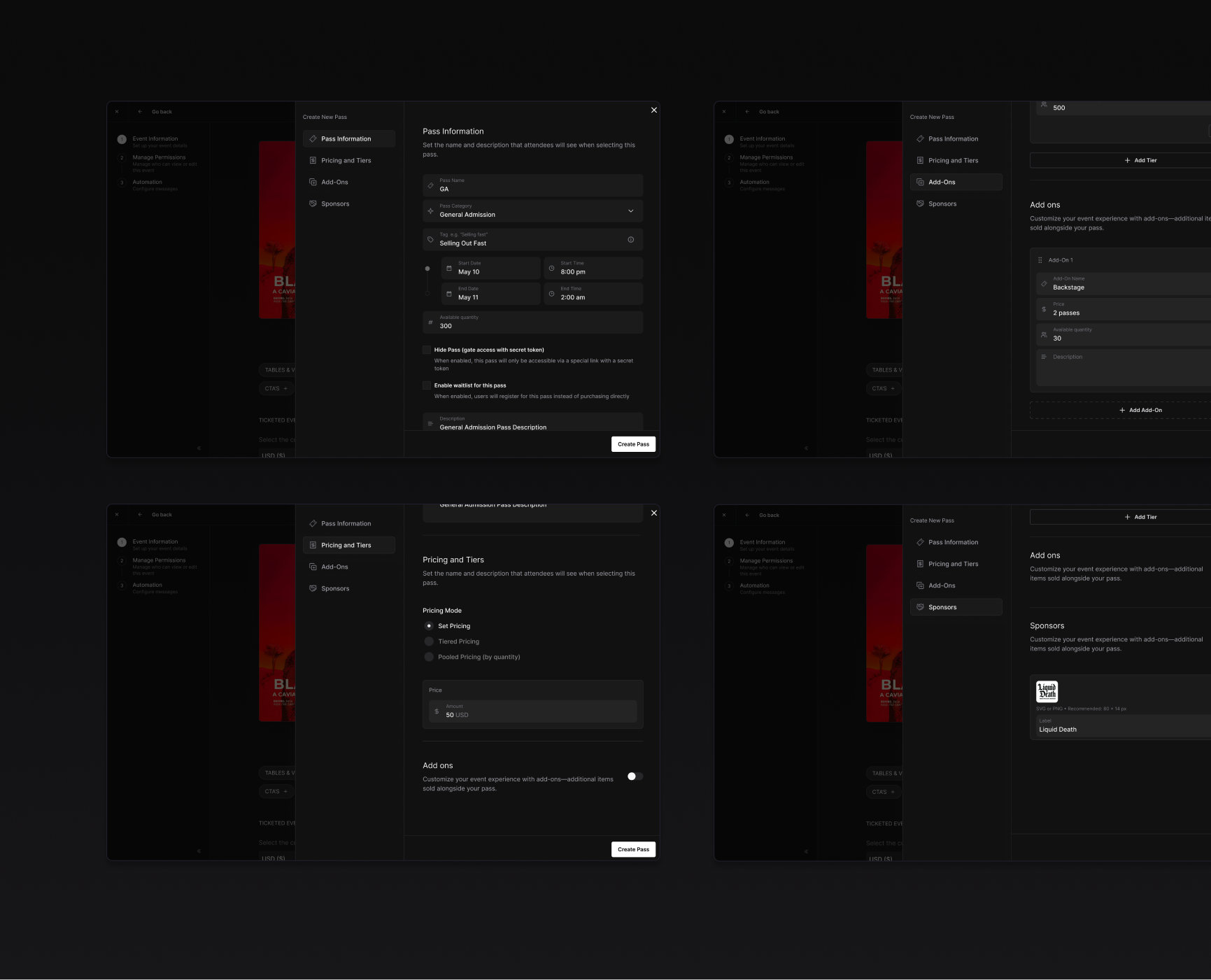
Passes was complex it carried pricing, tiers, add-ons, sale dates, inventory by far the most complex section. Each pass gets its own card with inline metadata: status, price, sold count, visibility. Same drawer pattern, same mental model. If it works for passes, it works for everything.
Complete the loop with Permissions and Automations
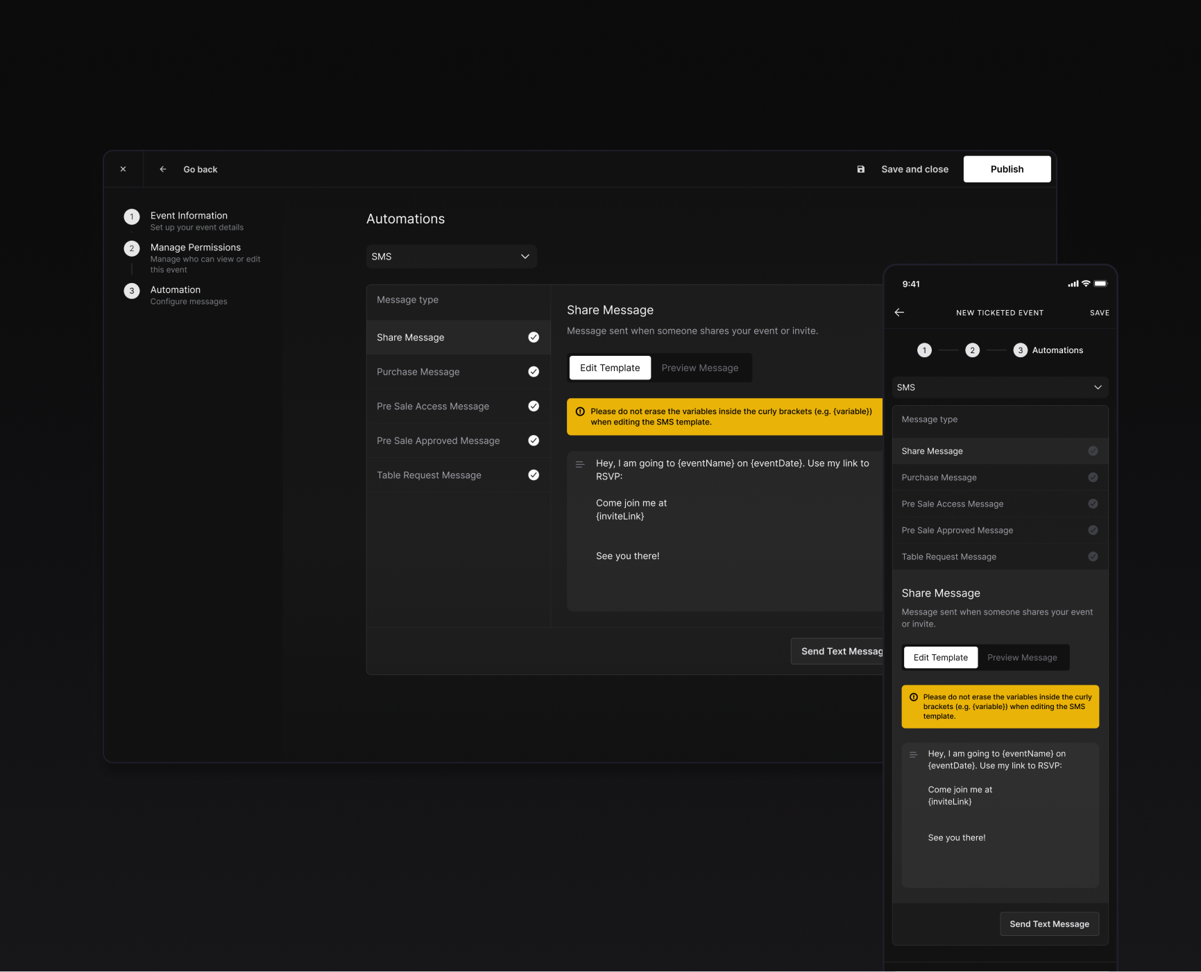
The event creator isn't just event details. Step 2 allows organizers to assign team access per event like full editing, view-only, or roles like Check-In Staff. Step 3 configures the automated SMS messages triggered at key moments: shares, purchases, pre-sale access, approvals, table requests. Each message type has an editable template with dynamic variables and a preview toggle. A three-step sidebar gives organizers a sense of progress without any single step feeling heavy.
The v3 event creator shipped as a faster, lighter tool that organizers found easier to follow and fill in. But the biggest win was structural. We built a system that could grow as needs arose and the product became more powerful. New features no longer meant a longer page. They meant a new chip, the same drawer, and another summary card. The pattern absorbed complexity instead of passing it to the user.
I worked closely with our PM throughout, and the back-and-forth between product thinking and design decisions made the work sharper than either of us would have gotten alone.